Trash of the Day: Friday - Trashtastic Lines
Hey there, Jeannette here with yet another trashtacular log, about the making of trash patrol. We use many different shaders for our game’s look, all of which went through plenty of iterations. This time, it is going to be all about our outline shader!
How the need came to be
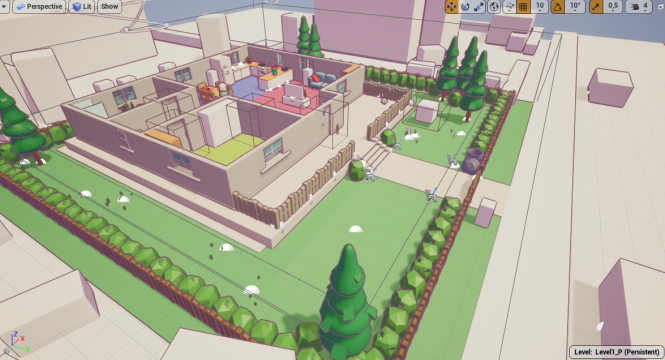
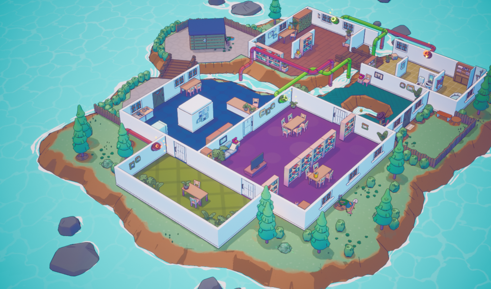
Way before we started prototyping our game, we looked at numerous references and brainstormed about distinctive style approaches our game might take, and settled for an overall rounded, colourful, artsy, stylized theme. We wanted the whole thing to be cute and cartoony, but not in a bold and harsh comic-style manner.
That, amongst many more influences, lead us to the conclusion, that our game would greatly benefit from making use of outlines, to be able to visually separate the environment, objects, and our raccoons better from one another.
Prototype type type type
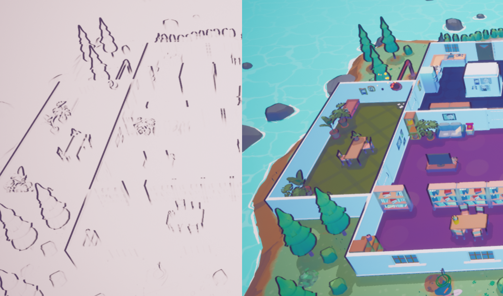
Trash Patrol’s first outline shader draft was created by our lovely team member Nessi, which then her and I further developed. But we quickly figured that bold and black lines didn’t really suit our needs and didn’t aid the game’s feel at all, so the first approach was to use colourful outlines instead.
After our huge concept rework our work responsibilities had to change slightly so that we would be able to publish our game by the time we had to.
Revamp
After facing several quite difficult limitations, we had with our so-far existing outline shader, our Shader graph started to get huge and thus more and more confusing. That was the point where a fresh start and revamped shader seemed due. So, I took the learnings from our previous one and started looking for different approaches, that would suit our needs and stay as neat as possible.
Baby Steps
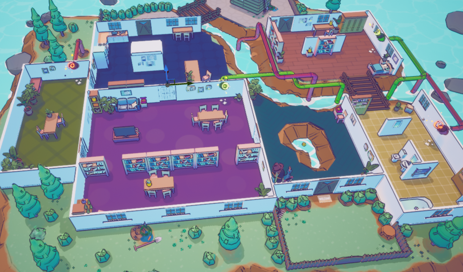
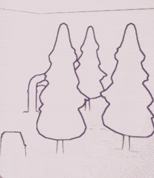
One of the first tries was to go by camera facing angles and create lines whose tint would be influenced by the geometry’s own colour. The effect turned out quite nice, but not what we needed. The adaptive hue gave a nice extra colourful touch but made everything less distinguishable from each other. Moreover, the edge detection didn’t really give quite the results needed and since our camera angle always stayed the same, horizontal lines were a big problem.
Said problem led me to a very different approach, where I tried to combine depth- and normal-based lines, to bypass limitations given by our static camera angle. The control we got over the quantity and thickness of our outlines was great but way over the top for what we were trying to achieve.
Many more rounds of trial and error later, which included different approaches for both normal and depth-based kinds of shaders, it reached a point where outlines looked neat and had a beautiful fade towards the bottom of the object. But as nice as the effect was, it just didn’t fully fulfil its purpose, as the fade looked great but made objects even harder to distinguish.
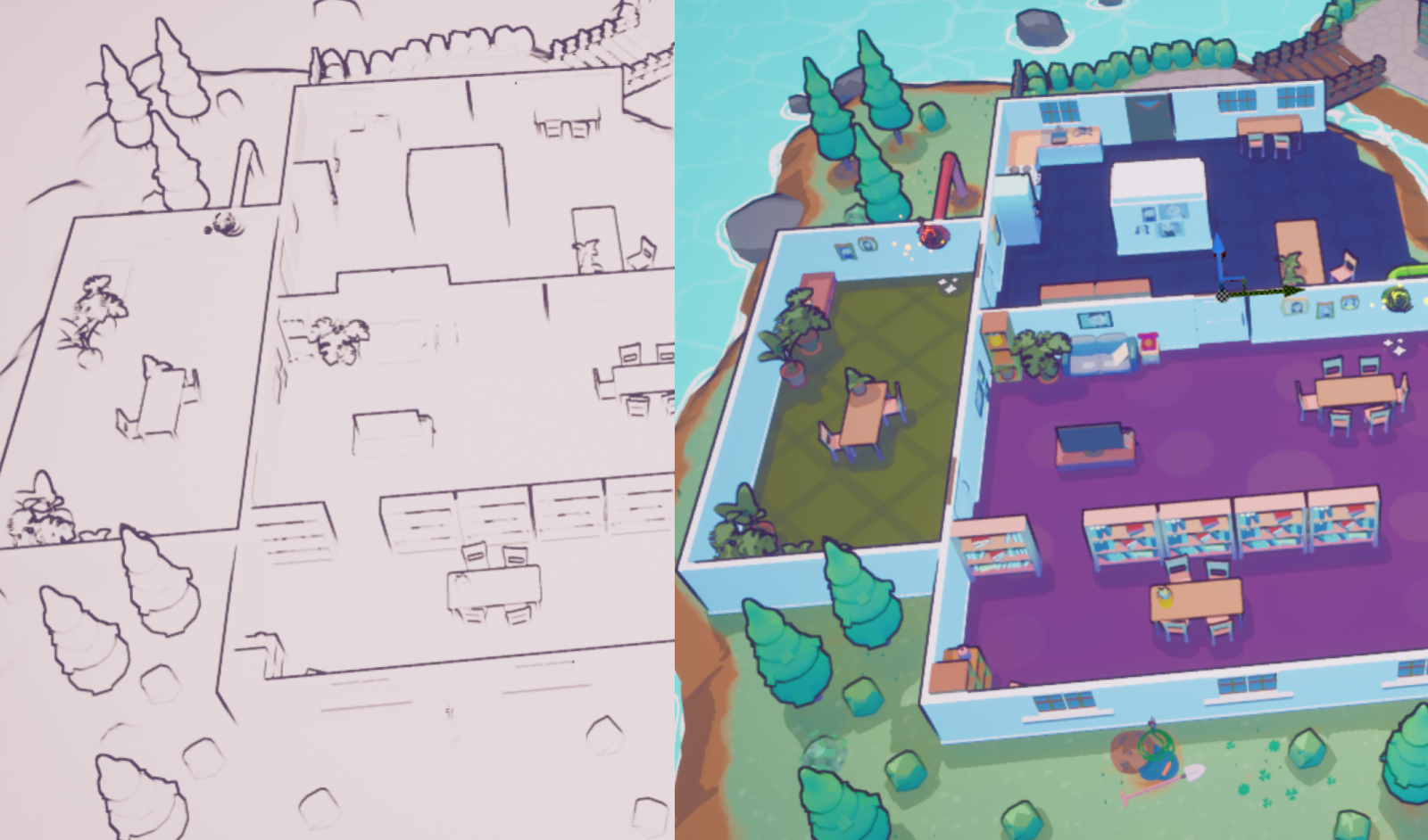
And since that showed us, that fancy isn’t always better and doesn’t necessarily aid your game, I created an array of different outline shaders, based on feedback and all of us voted and discussed what attempt we would take. Which lead us to our final and current version, fully depth-based but very fine lines, that made them not directly noticeable but helped support the distinction between environments and objects
Conclusion
Fancier isn’t always better and even if it might hurt to start over from scratch again, the result might just be what your game needs. Plus, it doesn’t mean that you can’t store your “failed” attempts in a library to maybe later use them in a different project!
-Jeannette
Leave a comment
Log in with itch.io to leave a comment.